How do you visualise a PV system?
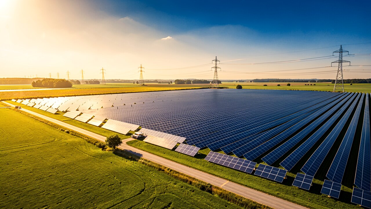
To visualise a PV system you need three things: a data source (inverter, meter or gateway), a place to store the readings, and a view that compares actual output against expected output. Everything else — flow diagrams, dashboards, alerts — is built on top of that chain.
Level 1 is the manufacturer portal that comes with your inverter (SolarEdge, Fronius, SMA, Huawei and others): yields per day, per string, no extra hardware. Level 2 adds a meter or gateway at the grid connection point so you also see consumption, self-consumption and feed-in as an energy-flow diagram. Level 3 reads the raw data into your own database and compares it with a physical expectation model — this is the level at which underperformance becomes a number instead of a hunch.
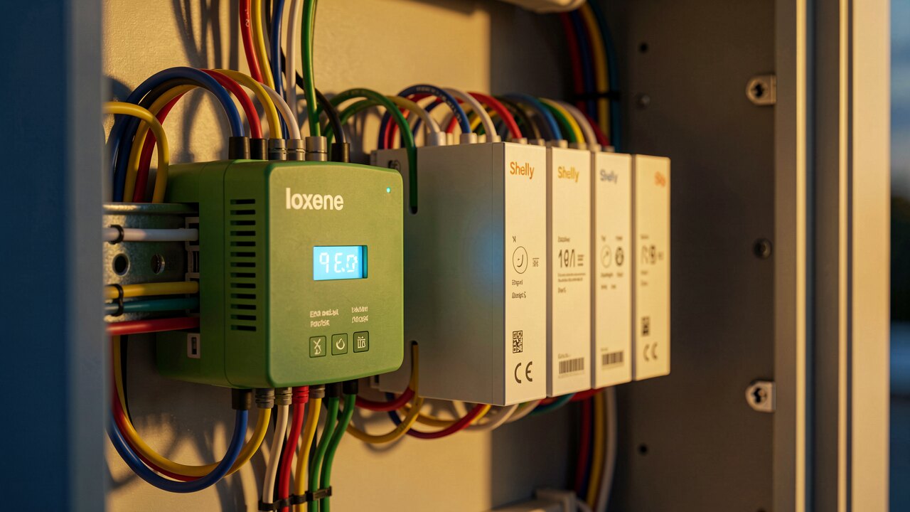
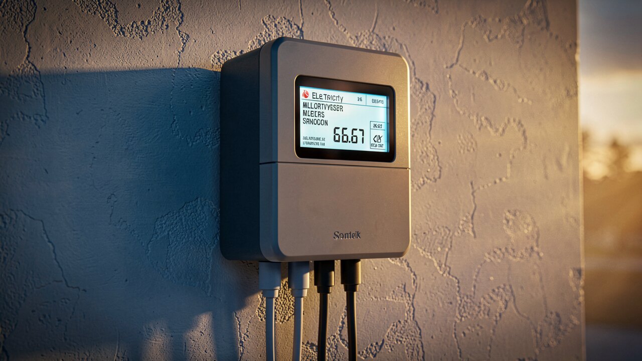
1) Identify the interface your inverter offers — most modern devices speak Modbus TCP, SunSpec or a REST/cloud API. 2) Add a bidirectional meter at the grid connection point if you want consumption and feed-in, not just generation. 3) Log readings at a fixed interval (15 minutes is the common billing interval in Germany; 1–5 minutes is better for fault detection). 4) Feed the values into a portal, a Home Assistant/Grafana setup, or a monitoring service. 5) Define what "normal" looks like, so deviations can be flagged automatically.
A chart of what your plant produced tells you nothing unless you know what it should have produced. Every plant has a physical expectation derived from its capacity, orientation and the irradiance it actually received. Comparing measured output against that model in real time turns "looks fine" into a quantified gap. This is the core of our PV Watcher tool: it monitors each plant continuously and flags the moment measured and expected diverge.
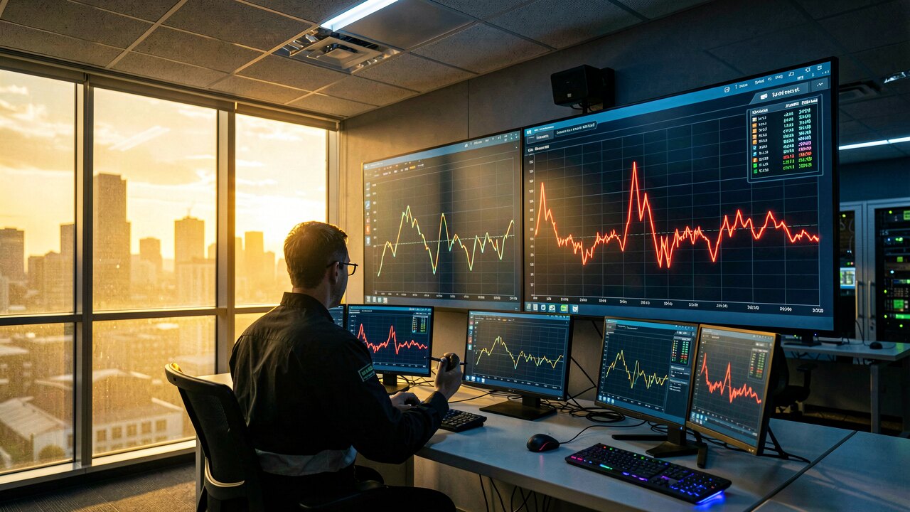
Dust, shading, a tripped string and an inverter failure each leave a distinct signature in the data. A slow, gradual drift downwards points to soiling; a sudden step change points to hardware. Distinguishing the two before you dispatch anyone is the difference between a cleaning crew and a service technician — and visualisation is what makes that distinction visible.
The Performance Ratio (PR) is the honest score: what share of the available sunlight the plant converted into electricity after all losses. Tracking PR over time is more useful than tracking kWh, because kWh falls in winter for entirely legitimate reasons while PR should stay roughly stable. A PR that trends down month over month means something is wrong that daily yield charts will hide.
For a residential rooftop, the manufacturer portal plus a meter is usually enough — you see yield, consumption and feed-in, and that covers most decisions. For commercial and utility-scale plants the calculus changes: at those sizes a few percent of unnoticed underperformance is real money every month, and market effects (negative price hours, curtailment, redispatch) mean generation data alone no longer explains your revenue. That is where plant-level forensics on open market data earns its keep.