PV Evaluation Displays: How to Read Your Solar System's Data
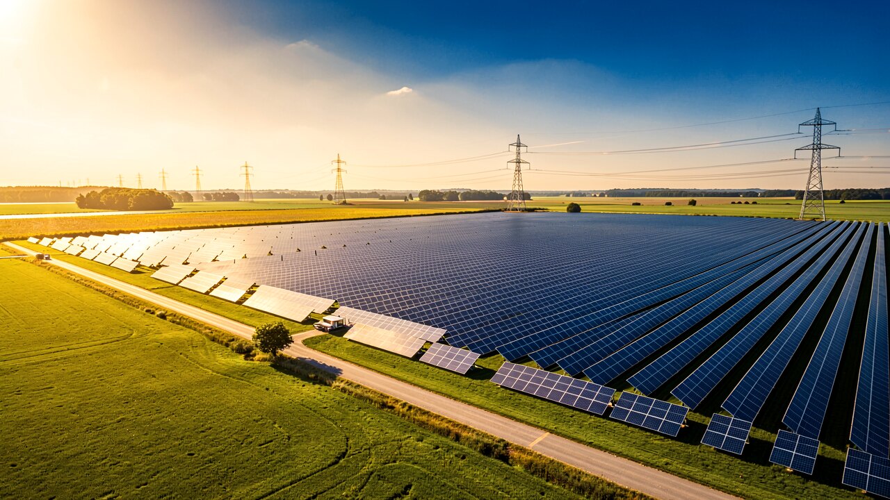
A PV evaluation display turns raw meter, sensor and inverter data into charts you can act on — daily yield, current power, and grid feed-in at a glance. This page explains exactly which values a monitoring screen shows, how to read them, and how to tell a real fault from normal weather variation.
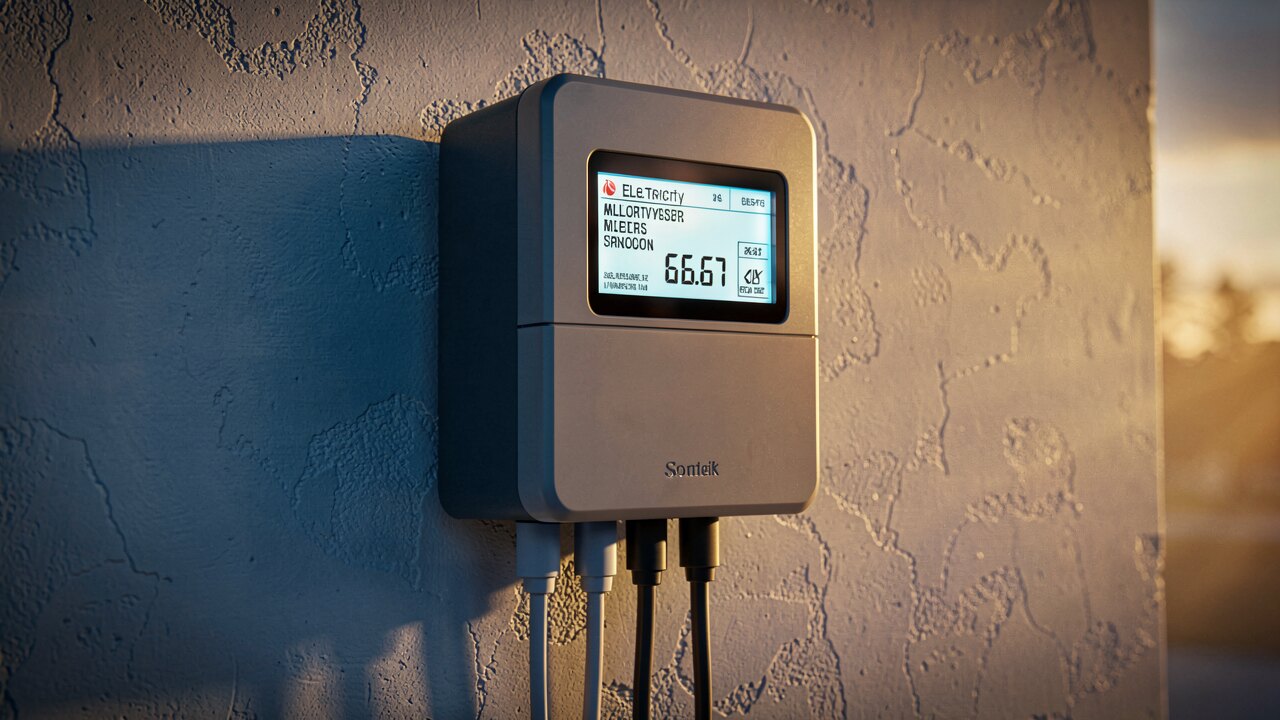
A monitoring display collects readings from your meters, sensors and inverter and presents them as live values and time-series charts. The core figures are: instantaneous power (kW) right now, energy yield (kWh) per day/month/year, self-consumption vs. grid feed-in, and per-string or per-inverter output. Good displays plot these over time so you compare today against expected performance, not just a single number.
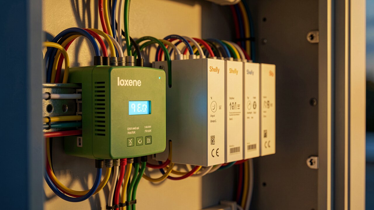
1) Current power vs. sunshine — when the sun is out, on-site generation should be high and grid draw should fall, not rise. 2) Daily yield curve — a clean bell shape peaking around midday is healthy. 3) Per-string/per-inverter values — one string far below its neighbours points to a local fault. 4) Feed-in vs. self-consumption — confirms your meter concept (e.g. Z3 = Z2 − Z1) adds up physically.
A smooth arch that rises in the morning, peaks near solar noon and falls in the evening is expected. Watch for: a flat-topped curve (inverter clipping or grid-side limiting), sharp mid-day dips (passing shade or a tripping inverter), or a curve that stays far below sunny-day levels. Dips that line up with clouds are weather; dips that repeat at the same clock time regardless of weather usually mean shading or a hardware issue.
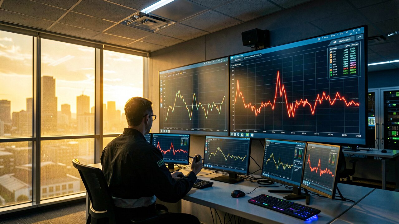
If total output is below expectation, work from cheapest check to most involved: compare each string against the others on the display, look for one inverter reporting an error or reduced power, check whether feed-in drops while irradiance stays high, and cross-check the live power reading against measured solar irradiance. Systematic elimination — visual data first, then measurements, then inverter diagnostics — narrows most faults quickly.
A display is only as trustworthy as the metering behind it. Sanity-check that the numbers obey physics: when generation rises, grid import must fall, and a virtual measuring point such as Z3 = Z2 − Z1 must reconcile against your Z1/Z2 meter data. In a real reference installation, measured PV output correlated with solar irradiance at roughly +0.91 over 146 days — a strong link is what a correct meter concept should show.
The goal of an evaluation display is not just pretty charts but a basis for action: is the yield within expectation, is one component underperforming, and is the metering sound? Turn each reading into a yes/no: expected output? faulty string or inverter? plausible meter concept? If any answer is no, that specific value tells you where to inspect next.