PV Monitoring App Comparison: What to Look For
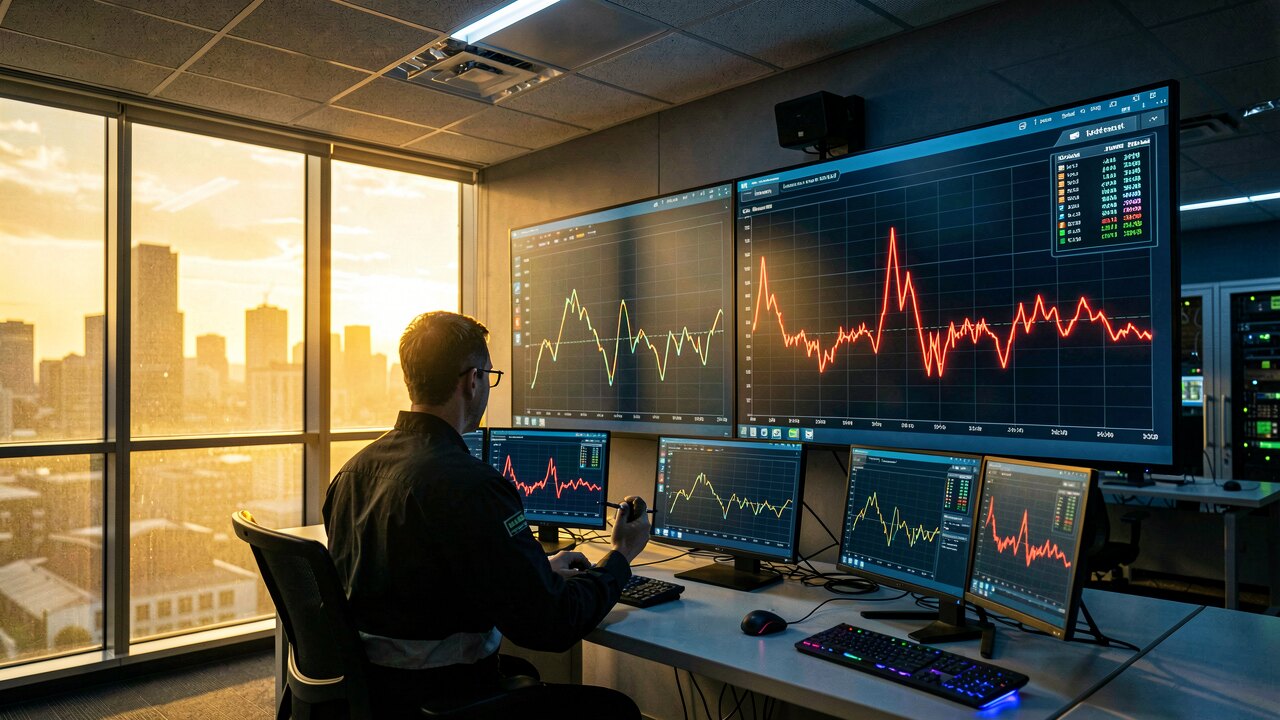
A PV monitoring app compares your plant's actual output against the physically expected yield and alerts you when the two drift apart. To compare apps fairly, judge them on six things: expected-vs-actual modelling, fault detection, performance ratio, alerting, hardware independence, and multi-plant overview.
Most apps just display inverter numbers. What you actually want is a physical expected-yield model: based on capacity, orientation, and the irradiance the plant truly received, the app calculates what it should have produced, then compares that to the measured output. A gap then shows up as a concrete kWh figure, not a guess. If an app only shows raw production without an expected baseline, it can't tell you whether a 'normal-looking' day was actually underperforming.
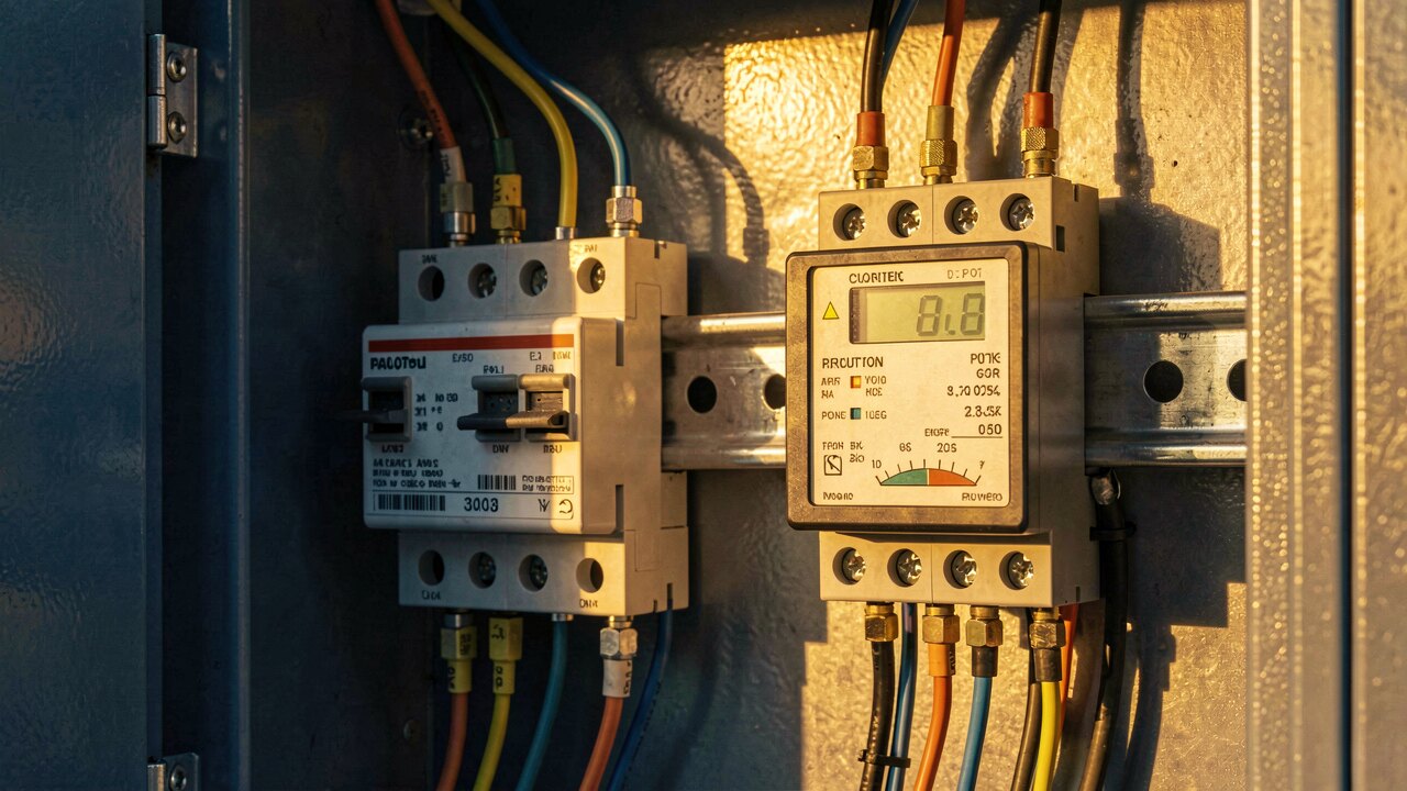
Dust, shading, a tripped string, or an inverter fault each leave a distinct signature in the data. A slow, gradual drift usually points to soiling; a sudden step-change points to hardware. A strong app distinguishes the two so the right crew gets dispatched. When comparing apps, ask whether alerts explain the likely cause, or just say 'output low.'
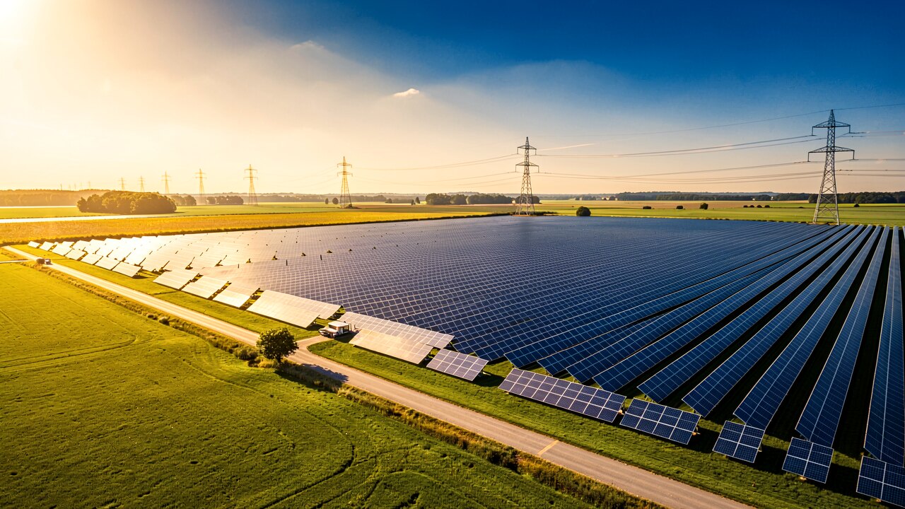
Performance Ratio measures how much of the available sunlight the plant converts into electricity after all losses. Because it normalises for weather and plant size, PR lets you compare a small rooftop to a large ground-mount fairly, and track one plant over time. An app that reports and trends PR gives you a single honest number; one that only shows kWh makes cross-plant comparison much harder.
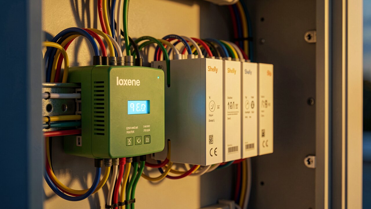
Underperforming panels leak revenue quietly. The value of monitoring is catching the deviation the moment it appears, not at the annual review. Compare how each app alerts — real-time deviation triggers versus daily/weekly summaries — and whether thresholds are configurable so you aren't flooded with noise on cloudy days.
If you run more than one plant, or mixed inverter brands, check whether the app is tied to one manufacturer's hardware or works across brands. A vendor-locked app forces a separate login per portfolio. Also look for a portfolio overview that ranks plants by PR or by deviation, so your attention goes where the loss is largest.
Pick one plant you know well, connect it to each candidate app, and watch a week of real data. Check three things: does it flag a day you already know underperformed, does it show expected-vs-actual as a number, and does it separate soiling from a fault. The app that turns your data into concrete kWh gaps and actionable alerts wins — dashboards that only mirror the inverter don't.